Ecommerce Conversion Optimization Checklist
– Posted by Pancham Prashar: http://moz.com/blog/holygrail-of-ecommerce-conversion-optimization-91-points-checklist
Invest in building filthy rich user experience, consistently and throughout your store. That is what stores with deeper pockets (like ASOS, Zappos & JCPenney) do to achieve better conversion rate than your store.
This article will take you away from usual Search Engine Optimization stuff to where the [additional] money lies – Conversion Rate Optimization. What you do with the visitors you bring to your website?

Whether you’re selling pajamas, concert tickets, shoes or shaving blades; e-commerce today has evolved and humanized beyond just convenience shopping . It is therefore imperative that you stop seeing people who land on your store as ‘traffic’; but as real human visitors. People come to your store and engage at various levels (let’s call these levels ‘touch points’). With each word that visitors read and with each media pixel they view at these touch points, they form a picture of your business in their minds. And based on whether or not they like the final picture, they make a decision about buying from your store or your competitor’s.
Know your Customers
- Use Qualaroo to Survey Visitors
- Enable Olark for Direct Chat Interactions
- Survey your Existing Customers
Home Page Optimization
- Show your Top-Selling Products on your Home Page
- Offer More Ways to Order from your Store
- Show videos on your home page (below the fold)
- Localize your store to specific countries
Navigation Optimization
- Avoid vague category structures
- Sort category structure by popularity
- Use CrazyEgg to create focused category navigation
- Create categories based on what people are searching
- Use a Compelling Business Tagline
- Avoid writing vague ‘Unique Selling Points’
Product Search Optimization
- Test your search for accuracy
- Implement an Intelligent search to cover singular, plurals, mis-spells etc.
- Implement Auto-Suggestions to help user search for relevant keywords
- Enable Category Search
- Let the user know what they searched
Product Page Optimization
- Get high quality product images
- Pay attention to your product’s description
- Show Product Videos (for your top selling products at least)
- Don’t let Price be a Surprise
- Empower visitors with creative calculators
- Clearly show the Product’s delivery time
- Allow them to select delivery date
- Enable Out Of Stock Notification
- Encourage users to leave reviews
Checkout Optimization
- Offer Persistent Shopping Cart
- Don’t make users enter the same information twice
- Pre-fill information where ever you can
- Preserve Information on a validation error
- Clearly mark the fields as optional or mandatory
- Give input example against each field
- Offer a unified single ‘Name’ field
- Automatically pre-fill city & state field as soon as user enters a zip code
- Keep the form field labels visible at all times
- Keep the form linear
- Form field length should match the expected length of the input
- Use FaceBook Connect
- Be specific with your button’s text
- Display validation errors in close proximity to the input field
- Display validation checks against each field
- Make ‘Account Registration’ an Optional Step of Checkout Process
- Don’t complicate Password Selection
- Make the ‘Guest Checkout’ option more prominent than Registration
- Make your primary button most prominent among rest all call to actions
- Avoid unnecessary buttons on the checkout page
- Primary button placement
- Limit the navigation and exit points on the checkout page
- Use Intelligent defaults
- Let users force-proceed on potentially wrong validation
- Process steps should function as navigational links for the checkout process
- Don’t surprise users by adding extra cost abruptly
- During registration, make the Newsletter sign-up an opt-in by default, not opt-out.
- Offer Brave Guarantees
Touch Point Optimization
- Write crisp & enticing Meta Tags
- Enable Open graphs
- Check your Auto-responder Emails
- Registration Emails
- Pay attention to your password Reset Emails
- Get your Order Confirmation Emails right
- Enable Order Shipped Emails
- Optimize the thank you messages on your store
- Make user friendly 404 Error Page
- No Results Found (Product / Page)
- Validation Error Messages
- Offer them multiple payment options: It’s a no-brainer but this checklist will look incomplete without it.
- Show Social Media Proofs
- Sign-up with Google Trusted Stores
Information Touch Points
- Show product close-up videos
- Educate the visitors and enable them to make an informed decision
- Create an impressive about page
- Support/Contact Page
- Get a thorough usability testing done
Load Speed Optimization
- Leverage browser caching
- Defer parsing of JavaScript
- Optimize images
- Serve scaled images
- Combine images into CSS sprites
- Minimize redirects
- Enable compression
- Minify JavaScript
- Minimize request size
Shipping and Returns
- Get your Shipping Policies right
- Offer Free Shipping
- Display the Free Shipping Threshold Order Value Prominently
- Offer a good returns policy
Customer Re-Targeting
- Use Ad-Roll
- Use Adwords Remarketing
- Clean your Email Subscribers’ List from time to time
- Offer Cashbacks
Before diving into the technical aspects of conversion rate optimization, we feel it makes sense that we talk a little bit about user experience first. However, there’s already enough written about ‘user experience’, so here let’s first define it and talk about one of the very often overlooked but biggest roadblock in the way of improving a store’s user experience (or perhaps any website).

User Experience – Defined simply, user experience is the sum of all the experiences that a user is offered on your store. It includes everything from visual, audio, aesthetic, usability, commercial and also the experience a user carries with her or him post the purchase. It is an extensively inclusive phenomenon and determines the way a user will ‘feel’, ‘think’ and ‘act’ on your store. Optimizing user experience is not an exact science but a mix between science and art. No one cookie-cutter formula works for all sites and it’s quite dependent on your niche industry and the target marketing you are aiming at.
There are many obvious challenges that every store owner has to face in creating a meaningful user experience on their store. It requires attention to the finest details.
To understand what picture your store has built and is projecting, you need to first break the entire user experience into unique experiences delivered at several of the touch points on your websites, for example:
- What is the immediate impression that a user gets when he or she lands on your store?
- What do users see when they type something in the product search?
- What do users get in their mail box when they register, reset password, subscribe or place an order?
- How are the users thanked when they perform an action, like new registrations, purchases, subscriptions etc?
- What happens if a user lands on an ‘out of stock’ product page?
- What happens if a user searches for a product that doesn’t exist?
- What does a user see if he enters an invalid email address during registration?
- How much information is required to be filled in order to complete the purchase?
- How does your store inspire trust in the heart of the visitors?
- How does your store reflect that you will promptly ship the purchased product(s) to his country on time?
There can be thousands of such instances that can make or break your store’s impression. Taking care of these touch points is one of the fastest and surest ways of growing your e-commerce business.

Most e-commerce stores (especially small to medium size enterprises) are built foremost for technology, aesthetics and average usability with Conversion Rate Optimization usually being left for a later stage.
Being an e-commerce specialized agency, we come across stores that are built upon high quality code and backed by high-end IT infrastructure but failing to deliver a meaningful or a memorable user experience.. This leads to users visiting these stores and leaving them without blinking an eye, let alone, making a purchase. With all memory erased of a damp store, they even forget that they ever visited such a store in the first place.
Just like these stores, you too have a chance to make an impression but if you fail there is no doubt that the user will leave within 15 seconds of landing on the website. Such instant abandoning will of course lead to allow ROI on the money invested in the development and marketing of the store.
The reason why this happens is simple. More often than not, most of the attention during store development goes into building the store, where designers design, programmers code the functionalities, testers remove the bugs, copywriters write content’ but nearly every job role is unable to give single minded focus and attention to creating an optimum user experience. Of course, any website that is created or built from scratch will take into account the user’s requirement but somehow a conscious investment into building an unmatchable user experience is still lacking in the initial phases of design, development and marketing processes.
So, the Agenda of this white paper is fairly clear – To give you a starting point to improve your Store’s Conversion Rate by identifying and working on the touch points which you might have skipped during development phase of your store. We have classified the work to be done on these touch points into easily readable and comprehensible ways, so that as a store owner you face no difficulty in recognizing the problem or implementing the solution to it!
Here we go:

Empathy is good but it doesn’t go well with conversion optimization. You can’t introduce changes on your store, simply by putting yourself in your customer’s shoes and hoping that visitors would love them and eventually start buying more. It’s far too much dependence on empathizing. If you want to improve conversions, you need fresh eyes and a different perspective than your own. You need to know your customers with the help of direct interactions and not just by empathetic assumptions.
Spend time and resources in knowing your business, your customers and your competitors before you create a single test. Many business owners and conversion rate experts create tests and winning strategies before even knowing the rules of the game (and how to win it). It doesn’t work that way until you’re 100% sure about what your customers want.
You can use the following tools to study your customer behavior:
1. Use Qualaroo to Survey Visitors: This Online survey tool (formerly called KissInsights.com) provides the quickest way of adding a short survey (usually just one or two questions) to important pages of your store.
Using Qualaroo, You can ask questions like:
- Why did you decide to buy from us?
- Would you recommend us to your friends or colleagues? Why?
- How was your experience shopping with us?
- How would you describe us to your friends?
- What would make you shop more often on our store?
2. Enable Olark for Direct Chat Interactions: This tool enables you to chat with visitors on your store and gives you intelligence about your business. This is very useful in identifying what issues people face while buying from your store in a live scenario while they are actually executing a purchase. This highly crucial insight can help you discover common patterns, frequent problems which can be shared with your development and marketing team for further improving user experience and usability on your web store.
3. Survey your Customers: If you have been in the industry for some time and have a formidable customer base, then the starting point of your store conversion optimization process should be reaching out to your customers and getting their perspective about your store & business. You can use SurveyMonkey to email slightly longer surveys (4 to 5 questions) to users and seek their feedback in return for sweepstakes. This is the quickest way to reveal hidden conversion issues if you have a good email subscription base.

4) Show your Top-Selling Products on your Home Page
Use analytical tools like Google Analytics and administrator reports to determine which products & categories are performing. Once these are identified, you should focus your marketing efforts in promoting your top selling products in banner sliders and recommended products.

5) Offer More Ways to Order from your Store
Clearly show all the different ways in which a customer can place an order on your store including the ‘by phone and by fax’ options. Nothing is too obsolete or inappropriate when it comes to establishing connection with your user; present to them all available contact points. ). Some customers prefer to order in a certain way, so clearly stating these options will help increase your conversion rate.
6) Show videos on your home page
What is the best way to persuade the visitors on your store about the quality of your product? Videos! Show the work that went into creating the product that you’re selling. A professionally shot video can add serious credibility to your claims. This is like making the features of your product apparent to your customers. Keep in mind that abstract terms such as ‘Art’ or ‘Quality’ may not help the user in drawing a concrete conclusion about your product. But supported by actual evidence such as: showing an artist carving an artifact and of course by audio-visual media, it makes customers believe that what you are selling is really art. Plus a video can command both attention and the desired connection with the customer.
This is exactly how Apple manages to create demand for their products and also sell them at a premium. The following video shows the work that went into creating the body of Apple’s new MacBook Pro laptop: Apple’s Marketing Strategy
7) Localize your store to specific countries
If you’re in the US and selling internationally, a good number of visitors and conversions on your store may be coming from countries outside your own. If these people know that it’s going to be an international shipment, they will need reassurance from you that you can ship to their country in time.
For this, you can enable a functionality that identifies a user’s country (from their IP) and show a notification on the top header, like ‘Yes, we ship to Australia’. This can give the user a lot of confidence when he orders from a store that’s outside his country. See how Threadless localizes its store internationally:

Along with it, see if you can change the currency of the entire store to currency of the user’s country (if you ship to it). This advanced level of localization can be achieved by putting in more thought and coding resources.

Most of the visitors landing on your store are in a hurry. If they sail through your navigation and come up dry, they might be put off from using the search functionality again.
The objective of a navigation menu (top, side or footer menu) is to make your most or frequently searched content easily accessible to these hurried visitors. You have two options – either clutter your menu by putting everything you have inside the menu, or intelligently show only those links that are important to visitors. Showing what’s important to you in the navigation may not help your store’s conversion. Leaving the visitor guessing might not help either.
8) Avoid vague category structure: The size of your inventory should correspond with the number of categories on your website. Don’t create too many categories on your store just for the sake of having them. Only include the links (to information) that users are actively searching for on the store and not the links that you think are most important.
9) Sort category structure by popularity: The category links in the navigation should be in the ascending order of their popularity wherein the most clicked links are at the top and the least clicked category links are pushed down to the bottom of the navigation. If not by popularity, you can also put all the links alphabetically because it’s one of the ways that users anticipate the standard navigation to be.
10) Use Crazy Egg to create a focused category navigation: Google Analytics site overlay is not very efficient in giving you intelligence about what people are clicking within your navigation. You might consider using Crazy Egg for this. Crazyegg is a tool that helps you see heatmaps and also helps in implementing the info you gain from them about your website. Even Crazyegg can’t generate heatmaps for links inside Javascript menus and pop-ups (under ‘not visible’ tab), however it can give you list of links inside the menu along with the number of clicks.

Create categories based on what people are searching: Use Google Analytics to find out what visitors are searching in your store’s product search box. You can view the search terms by following this path in Google Analytics:
11) Create categories based on what people are searching: Use Google Analytics to find-out what visitors are searching in your product search box. Google Analytics > Account > Standard Reporting > Content > Site Search > Search Terms.

The keywords with top ‘total unique searches’ are the ones that people are searching for. You will find the top searched product and brand names here. These are obvious contenders to be placed at prominent places inside your navigation menu. A navigation based on users’ preferences and popularity of products rather than on conventional categorization can have a positive impact on the conversion rate.
12) Use a Compelling Business Tag-line
Visitors on your store pay more attention to your business tag-line (small text, just under your logo) than you think. In many ways, your business tag-line gets equal attention as your logo does. Putting a little more effort and creativity while creating a business tag-line that summarizes the experience you’re offering to the user on your store can get further drive the customers to make a purchase on your store. A great tag line can form immediate connections with the visitors by positioning your business at the spot where they would want to see it.
13) Avoid writing vague ‘Unique Selling Points’
You don’t need an MBA degree to know that you must tell your visitors clearly and exactly what your Unique Selling Points (USPs) are. Why they should buy from your store? Strategically presented USP on your store can help you counter the mental barriers in the visitors’ mind that might be stopping them to buy from your store.
Bedding.com is a good example of vague USPs, for example: Easy Returns, Free Shipping, Price Guarantee, Risk Free Shopping:

Thus, avoid writing vague ‘unique selling points’ on your store, for example: Satisfaction Guaranteed, Fast Shipping, Best Deals etc. Be specific, such as: Free Shipping on orders above $50, $10 Flat Shipping, 100% Organic Products, 60 Days Return Policy etc.

If your store is like many others, then the off your market visitors enter your store from the home page. If they know what they want, they would straight away search the product name in the store’s product search box. An inaccurate or dysfunctional product search can hurt your business in the form of lost sales, especially when the size of your inventory exceeds the scale at which it can be manually browsed.
Sometimes, users are not able to locate the product search. You can use Google Analytics (Content > Site Search > Usage) to know whether or not users are actively using product search.

You will notice that the conversion rate of visitors using product search is higher than visitors who are not using product search.

One of the possible reasons of low usage of product search is the placement and presentation of the product search functionality. You must highlight the presence of product search functionality by using both better placement and aesthetics. This will ensure that search box doesn’t get lost with the other elements on the page.
You should have an effective search feature on your store, which is:
- Easy to use: Gives clear instructions on what and how a user can search.
- Fast & Accurate: If your inventory size is huge, you can use 3rd party engines like Celbros or SOLR to return search results faster.
- Friendly: Think of what users will see if there is no product match in the inventory.
14) Test your search for accuracy
Test your search for accuracy by searching keywords (singular & plural). For example, if you’re running a sporting goods store, a search for ‘basketball’ & ‘basketballs’ should return the same results associated with basketball(s).
15) Implement an intelligent search to cover singular, plurals, misspellings etc.
Your store search should be intelligent enough to return results as per the intent of the searcher. For example, the top listings of a search should return ‘basketballs’ and not ‘basketball jerseys’. If the user wanted a ‘basketball jersey’, he would have searched this term. Test your search with similar key phrase combinations and see how accurate it is.
16) Implement Auto-Suggestions to help user search for relevant keywords
It’s a commonly used search functionality wherein you show keyword recommendations, as the user types his search query in the search box. This feature helps users to search the right keyword and makes it easier for them to find the desired product more quickly. If this feature functions properly it can push users to purchase from your store.
Implementation of most product search engines (like SOLR & Celebros) requires considerable investment of time and money. If you can’t afford to invest in search but still need to manage a huge inventory search, you should at least have a category level search so that users are able to search in a particular category.

18) Let the user know what they searched
While displaying results for a search, always let the user know what ‘keyword’ they searched. Don’t test their memory and help them search the product right keywords.
For example, searching for a keyword like ‘Sandals’ at NineWest.com returns no results (it’s not that they don’t have sandals, it’s just that their search functionality isn’t that great). It also doesn’t show what keywords exactly did the user search. Imagine, if a user misspelled a keyword, she would abandon the store with an impression that the store doesn’t have what she is looking for. She won’t realize that she actually misspelled the product name in the search box.


19) Get high quality product images
People no longer want to browse a website – they want to experience it. An image is ALWAYS the first thing that a visitor will notice as soon as he lands on your store’s product page. Good product images can add life to your store and help your store convert better – there are no two ways about it.
Images are more sense-oriented and may not evoke an emotional response:
- Pay special attention to the default image of the product description page. It should be really high quality.
- Avoid using generic stock photos. Take actual pictures of real persons using your products. A real product picture (taken from an average camera) will convert better than a cheesy stock picture.
- Don’t just show a single image, show as many as you can – from different angles.

20) Pay attention to your product’s description
After the product image, the other element that plays an important role in improving the conversion rate of your store is the product’s description.
Internet is full of “killer” copywriting words, winning sales layouts, etc. Let us tell you from our experience that these tricks won’t take you very far. In fact, they will take you nowhere. A mile long sales page won’t convert if you don’t understand exactly ‘what’ will persuade visitors to buy. This is what we suggest that can make your product descriptions more compelling:
- Keep the most important features of the product at the beginning of paragraphs and bullets.
- Don’t try to pester, persuade or build a hype about the product – users will know if your claims aren’t genuine.
- Offer two versions of the product description – summary and detailed. Product summary will be read by the visitors who are in a hurry and the detailed version will be read by visitors who are willing to spend more time knowing about the product and getting more confident about their buying decision.
- Use bulleted points to make the information easier for the visitors to consume.
- Link out to privacy pages, shipping, return policy & FAQs.
Users have apprehensions about privacy, shipping details, FAQ and returns policy. Keep these pages within easy reach of the product pages & checkout screen.

(see how Zappos links to important information from its product page).
21) Show Product Videos (for your top selling products at least)
Because your images can’t talk. With the technology getting cheaper and more accessible, more and more stores are embracing videos to show their products. If you haven’t given it a shot yet, do it now. Show videos along with product pictures and see if the addition impacts the sale of the product.
22) Don’t let price be a surprise
When visitors don’t buy, one of the biggest reason is that the user finds the price either too high or the product description too vague to back up the claims.
Price must stand out on the page. Use large font size, bold formatting, and a different color. Full price or estimated full price – should be shown to the user as early as possible. Shipping and handling prices if listed too late in the checkout process can also be one of the reasons for a higher cart abandonment rate. Design the checkout process in a way that there are no surprises for the user. It’s not just the product price, the visitors might also find your shipment and handling charges too high. If there are any taxes to be included, show the total amount on the product page before the user checks-out.
23) Empower visitors with creative calculators
There are many types of calculation tools that you might want to offer to enable them to shop the exact product specifications they want from your store and in the quantity and quality they prefer. For example – shipping calculator, size calculator etc.

24) Clearly show the product’s delivery time
Buyers want to be in control of the transaction when buying from your store. On the product page, let users know when they can expect to receive the product if they order.
25) Allow them to select delivery date
If the product’s expected delivery date doesn’t suit the user, you can give user the facility to delay the delivery or predate it. So, if a user is going on a holiday for 4-5 days and which also happens to be the expected delivery date, you must enable the customer to select a delivery date and leave a comment as well.

26) Enable Out Of Stock Notification
We recommend adding an “email me when item is restocked” feature wherein you prompt users to submit their email address so that they can be notified as soon as the product returns back ‘in stock’. This is an automated process but there are ways of giving this ‘auto responder email’ a more personal touch.
27) Encourage users to leave reviews
Collecting product reviews has to be made part of the sales process itself. Using auto-responder emails, prominent call to action buttons etc. can further help in enhancing sales and generating better response from the users.
After the Panda & Penguin update it’s critical for store owners to keep their website updated with fresh content all the time. It may not always be feasible to create unique copies for each and every page on the website or adding content to different pages at regular basis. This is where user generated content comes in handy. Thus content like user reviews can have a direct impact on traffic, conversion rate and average order value of your store.
Not only do good product reviews add a lot of content on a product page but stand as credible testimony to the high quality of the product. Positive customer reviews make your store more shop worthy and thus can have a direct impact on the store’s conversion rate.
Along with offering a provision for product reviews on the product page itself, you can also send an auto-responder to all your customers after a specific number of days (depending on the nature of product that you’re selling). Send a link in the email where they can share or post about their experience of using the product.

Users are most vulnerable to abandonment during the checkout process. An effective use of text, icons and symbols is necessary to overcome all user apprehensions & objections that users might experience without overwhelming them. Here is what your checkout page should reflect:
- Security: Let users know that your website is secure and that their privacy will never be compromised.
- Transparency: Be transparent and include accurate shipping & tax details.
- Payment Methods: Clearly show all the payment methods users can use to make the payment (PayPal, Credit Cards, Google Checkout etc.).
- FAQs: If you think there are additional FAQs, you can cover them in a checkout related FAQs section.
28) Offer Persistent Shopping Cart
A lot of users add a product to cart, thinking they will complete the purchase or checkout later. Offering them a persistent shopping cart will be very useful for both the users as well as the store. This is because, if on their return they see the cart empty, they might not start again. They will prefer to abandon the cart instead of going through the process again.
A good solution to the problem is enabling persistent shopping cart on your store so that user finds the products in the cart until he removes them. If you’re wondering for how long should the product stay in the cart? The longer the better.
29) Don’t make the user enter same information twice
As much as you might think that users want to spend time on your store, the truth is that users want the buying process to be over as soon as possible. Start by removing the extra or avoidable fields on your website. A user in any case would never like to fill in the same information twice. It’s not a good idea to make them enter the same information twice. For example, during checkout process, don’t make a user enter his shipping address and then enter the same information in the billing information fields again. This doesn’t make sense especially when only a small fraction of customers want to give a billing address that’s different from their shipping address. There are many ways how you can get rid of this unnecessary step, for example: you can enable a checkbox (or something similar) that enables the user to choose whether or not user wants to give a different billing address.
30) Pre-fill information where ever you can
Like we just said, you’re not making your customers happy if you’re making them enter the same information twice. If a customer has already provided some information in step 1, don’t ask for it again in step 3. If you have to, automatically pre-fill the fields so that user doesn’t have to enter it again.
31) Preserve information on a validation error
This is an extension of previous two points. Don’t make your customers enter same information twice. If and when there is an error somewhere in the form, all entered information should be preserved. There is nothing more annoying for a user if he loses all the entered information because of a tiny validation error in one of the 15 fields on the form page. It can really drive a user nuts.
32) Clearly mark the fields as optional or mandatory
Make sure that you use asterisk (*) to clearly mark optional fields. It can confuse a user if he is not able to proceed because he is missing out filling some information which has not been marked as a mandatory field.
33) Give input example against each field
To minimize the chances of user hitting validation errors, you can show correct input examples next to each form field so that the user can know the correct way to enter the required information.
34) Offer a unified single ‘Name’ field
Offering extra field or two to make user enter middle or last name is unnecessary. It makes more sense to offer a single unified name field to the user.
35) Automatically pre-fill city & state field as soon as user enters a zip code
You can make the user’s life easier by implementing an intelligent data input system. Auto-detect and pre-fill city & state field as soon as the user enters his ZIP code.
36) Keep the form field labels visible at all times
Many stores show the input labels inside the input field to keep the form clean. Although this design approach makes the form look less cluttered, if the user is in a rush, he might click on the label before reading it. In such a situation, he would be confused about the required information he is supposed to enter in the field.
User starts from the top and work their way from top to the bottom. If your form has a trigger field, keep it right below the field that triggers it. For example, a state field should always come after the country field. On the shipping information page, if by default you show US states before the country selection field, user might get an impression that you don’t deliver to their country because triggered field is above the field that the user is working at.

38) Form field length should match the expected length of the input
Most of the users closely relate the length of an input box with the input they are supposed to enter in the field. For example, if you’re asking for a CVV number, don’t make the length of the input box same as the credit card field just for the sake of design symmetry. Similarly, don’t allow more than 12 digits in the credit card field:

This can make some of your visitors less certain about whether or not they’re entering the correct information.
With the help of Facebook connect, you can encourage more visitors to buy from your store by allowing them to login and complete their purchase using their Facebook username & password. This is better than forcing them manually register to complete their purchase. It saves their time and thus they are more likely purchase from your store.
40) Be specific with your button’s text
Avoid using generic button text for example – ‘continue’ because a button named ‘Continue’ if used in a shopping cart could mean two actions to the user:
- Continue ‘shopping’ – continue adding more products to the cart.
- Continue to ‘checkout’ – continue to checkout and pay.
This can make the user less certain while shopping on your store. Thus, it makes more sense to make the buttons more descriptive with text like ‘continue shopping, ‘continue to checkout’ etc.
41) Display validation errors in close proximity to the input field
This is one of the most common usability issues found in many e-commerce websites. The validation error is displayed at the top of the form and in most cases it remains hidden due to scroll.
42) Display validation checks against each field
The best practice is to show the validation error right next to the field and show a ‘check’ mark the moment user enters correct input. This gives confidence to the user that he is heading into the right direction.
43) Make ‘Account Registration’ an Optional Step of Checkout Process
Do you know that a recent Econsultancy / Toluna study found that 25.6% of online consumers would abandon a purchase if they were forced to register first.
Forcing a user to register in order to complete purchase can make your customers feel that they’re not in control while buying from your store. This increases the chances of cart abandonment by the user.
Here is an example where account registration is a mandatory step of buying process:

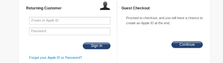
Thus, if you’re also forcing your visitors to register to complete purchase, providing a guest functionality clearly is the easiest way for you to improve your store’s conversion rate.
Apple does a good job clearly defining that use can either login or checkout as guest.
44) Don’t complicate Password Selection
Avoid applying complicated validations to the password field. Let users easily select a convenient password and don’t force them to create something so difficult that they can’t easily memorize.

(Selfridges.com not only forces a user to sign-up in order to complete check-out process but also select password in a specific format)
45) Make ‘Guest Checkout’ a more prominent option
If you make ‘register as new user’ a more prominent option, users might perceive that they are being forced to register on the website to complete their purchase. Thus, with the help of design elements and typography, you should make Guest Checkout a more prominent option than ‘register as new user’ option.
46) Make your primary button most prominent among rest all call to actions
While surfing, our eyes act on buttons based on their prominence (size and color) instead of what they read. On a typical checkout page, there can be various buttons like ‘save’, ‘redeem’, ‘apply’, ‘ok’, ‘calculate’, ‘cancel’ etc. Make sure that the primary buttons of your checkout page are ‘Buy’, ‘Next step’, ‘Continue checkout’, etc. Make these visually the most dominant buttons or else a lot of users who are in a rush will end-up clicking on a wrong button.
47) Avoid unnecessary buttons on the checkout page
Show only the primary buttons on the checkout page and avoid unnecessary ‘apply’ buttons. Use AJAX to auto-submit the information as soon as it’s entered in the field. The changes should be applied immediately without reloading, and in close proximity with the input field.
Inconsistent prominence and placement of primary buttons can confuse the user about whether or not a button will result in the execution of the primary function of the page. Most users expect a primary button to be placed on the lower right or left corner of the visual frame. Also, make sure that the primary button is placed consistently throughout the entire checkout process.
49) Limit the navigation and exit points on the checkout page
You have done all the hard work to help a user find products they want and add to cart. They have made the payment for their purchase and have entered the shipping address. Get rid of everything from the checkout page that might distract users away from the checkout page. Get rid of header navigation (or trim it), search and only show things that encourage users to complete the purchase for example – Guarantee, Return Policy, Support Information etc. Flipkart.com has a very clean and focused checkout process with almost no navigation.

Use intelligent defaults in the most commonly selected values that users select so that customers can proceed with little friction. For example, you can help users make a decision by pre-selecting the most popular shipping option. If you don’t want to give a pre-selected option, help them in making the choice by labeling the most popular option as ‘recommended’.
51) Let users force-proceed on potentially wrong validation
Many forms are designed in a way that users are forced to correct the validations of the unimportant or optional fields. You should allow your customers to force-proceed through potentially wrong validation errors; for example – it might not make sense to stop a user on the ‘shipping information’ screen of the checkout process and force him to remove special characters.
52) Process steps should be presented as navigational links during the checkout process
Many checkout processes make the checkout page look like a chronological process by breaking the entire process into steps, for example:
- Step 1: Register
- Step 2: Shipping Information
- Step 3: Billing Information
- Step 4: Select Payment Method
- Step 5: Pay
Most store owners make these steps clickable allowing users to go forward to the next step. But very few stores allow users to go back to verify the selected product or information entered by clicking on the previous step. Allow users to maneuver both ways (forward and back) by clicking on the checkout steps.
53) Don’t surprise users by adding extra costs abruptly
If users suddenly see an increased cost when they checkout (i.e. when they’re least expecting it), they will feel that they’re being tricked. Let users know about any extra costs (for example – shipping & handling charges or taxes) in advance on the product page itself. It should be clearly shown when extra cost is being added to the order during the purchase process.
54) During registration, make the Newsletter sign-up an opt-in by default, not opt-out.
When users are registering you don’t want them to feel tricked into signing-up for your newsletters. Let it be more of a permission than a trick. Not only will it make your business look more legitimate but will also help your email marketing campaigns in the longer run.
Most buyers expect some form of guarantee when they purchase from your store. Try giving different guarantees. Test bigger and a bolder ones for different shopping seasons. Check if your site is prominently displaying these guarantees on important pages of the store (e.g. Product description, cart and checkout).

56) Write crisp & enticing meta tags
Although, this is essentially a part of Search Engine Optimization, but Meta tags are the first level of contact with potential customers who are searching for keywords relevant to your business on various search engines. Thus, title and description tags are not only important touch points but also the doorway to your store from Search Engines. Thus, make sure that your meta tags read well.
You can use Google Webmaster Tools (Traffic > Search Queries) to check the Click Through Rate of the keywords that your store is ranking for and make necessary changes in the meta tags to achieve better CTR. If the avg. position of a keyword is good (within top 10) but the CTR of the keyword is low, it’s an indication that the meta tags of that page might need rework.

Lots of visitors on your store might land from social media websites such as Facebook. Similar to how meta tags help you show how your store listings look on Search Engine Result Pages, Open graphs will help you control how the pages on your store look, when shared on Facebook. Since many users might discover your store on Facebook, these open graph settings become important touch points for your store.
(see how, MrPorter.com has enabled open graphs on their store to make it more share friendly). You can use Facebook debugger to see how your page looks when shared on Facebook.
58) Check your Auto-responder Emails
Auto-responders are the email notifications that your system automatically sends to users at various instances like: new registration, password reset, order confirmation etc. These emails are important because these are your first personal communication with your customers. Reflect that you do business sincerely and can be trusted for fast order fulfillment too.
This is the automatic email that goes out to users when they register on your store. The format of these emails varies from business to business. But there are a few things that remain standard to most businesses, for example:
It’s a good idea to include your company name in the sender field, the subject line or both. If the customer wants to spot your email among the rest, this would help them find it faster. Make sure that you use words like ‘welcome’ & ‘thank you’ in your first auto-responder. Include customer support information and encourage users to join you on your social media pages like Facebook, Twitter, Pinterest.
60) Pay attention to your password Reset Emails
You can safely assume that many of your users will register and forget their user name or password when they visit your store again (check the visits on your forgot password page from your Google Analytics account if you need proof). This is a very standard functionality that almost all online stores have in which a user enters his email address and receives his password or password reset link in his email. Now, since it’s so standard, store owners tend to ignore the language and presentation of the following touch points:
- Password Reset page, where user enters his email address
- Confirmation page where user gets the confirmation on the user’s password request
- Password reset email that goes to the user

(This is how JcPenny acknowledges their users to the password reset request)

(ASOS sends a plain text message to users as password reset email)
61) Get your Order Confirmation Emails right
These are the automatic emails that go out to users when they make a purchase on your store. And since these emails have very high open rates, it’s important that you pay attention to what users see in them. While these emails are effective instruments to drive return visits to your store, it is important that your customers also perceive it as a great service.
Order confirmation emails are a great opportunity for you to offer deals that entice the user to buy more. Other than this, you can also introduce the buyer to other products he might like. If you engage with your customers in your order confirmation e-mail, they’ll probably be more receptive to your future emails.
As part of your store’s touch point optimization, scrutinize your confirmation e-mail messages to ensure that your email reinforces why your customer bought from your store at first place and then cross-sell other products.
62) Enable Order Shipped Emails
This is also an automatic email that goes out to the buyer when the product is dispatched from your warehouse. It’s triggered by your system when the product is marked as dispatched by your warehouse manager. This email is also very important because from the time they place the order till the time they receive the delivery, users are most receptive to your messages. So apart from giving the order tracking link and user login link in your e-mail, you can also ask the users to check the action happening on your social media pages.
63) Optimize the thank you messages on your store
Your store has thank you pages created by your development team that trigger at various instances when the user takes a desired action. These can be actions like:
- When user places an order
- When user subscribes to your store
- When user registers to your store
- When user chooses to be notified when an order is back in stock
Pay attention to these pages because these are reached only by the users who were receptive and decided to trust you. Thus, they are likely to take more actions if you give them enough reasons to.
The actions you can ask them to take on these thank you pages are:
- Sign-up for your Newsletters: Once a user has completed the purchase, you can insert an opt-in box in the Thank You page and then encourage the user to subscribe to your store’s newsletter.
- Encourage Social Media sharing: You can embed social media sharing buttons neatly with benefits of joining. For example, you can tell the user that you’re giving away free gifts, discount coupons etc. to your Facebook fans.
- Ask for feedback: After a user completes the purchase, you can give him a survey and ask him to share his experience on your store. Since he just been on your store or has completed a transaction, he will be more likely give you a candid feedback.
- Offer Support: Show a customer support number or email contact option in case they have any concerns regarding order fulfillment or they want to buy anything else.
Error Messages
There will be many instances when users do something unexpected on the store. Your system will trigger various error messages for these unexpected actions. More often than not, these error notifications are written by programmers and are lacking in about human touch. There are different types of error notifications that a user can encounter on your store:
64) Make user friendly 404 Error Page
This error occurs when a user requests for a page that doesn’t exist on the store. There are potentially many ways, how a user might request server for a page that doesn’t exist, for example: URL changing during store migration, Admin deleting page(s), Incorrect hyper linking etc. As there is no web page at the location requested by the user, the server sends a page that simply says “404 Error – Page not found”. As a best case practice, your store should have any or all the following elements:
- Friendly Error Message
- Search box
- Customer Support Information
- Direct links to the most important pages

65) No Results Found (Product / Page)
This error is displayed to the user when your system fails to find a result matching the query user has entered into the product or page search box. Programmers usually display errors like “No match found”. Since there are many instances in a day when visitors might see this error notification, it’s an opportunity for you to leave an impression.


(see how Zappos engages with visitors when they search for a product name that doesn’t exists)
These types of messages are displayed by your system when the user enters a value in ‘input forms’ that is not supported by your store. For example, when a user enters a phone number in an input box where he should be entering his email address.
Places where these validation error messages are encountered by a user are:
- Registration form
- Login form
- Email Sign-up forms
- Pre-Order forms
- Contact forms etc.
Again, since these validation errors are designed by a programmer who won’t bother about the tone of the message, at times these validation messages may sound either rude, confusing or unnecessary.
Trust Points
There is always a psychological barrier & objection in the mind of users when they’re engaging with your store. The objective of optimizing the touch points below is to find all the objections that a user might have in his or her mind, and suggest changes to build and inspire trust & confidence in them.
Do everything to earn as many accreditations for your business as you can, like: BBB, Bizrate, Verisign etc. Show these badges on your store to give the user an impression that they are doing business with a genuine, secure & ethical company.

67) Offer them multiple payment options: It’s a no-brainer but this checklist would look incomplete without the mention.
Accept multiple payment types – Visa, Mastercard, PayPal, Amazon, and Google Checkout etc. People always have a preferred method and showing them logo of that payment processor can encourage them to buy from your store.
The easiest way to make people trust your store is by showing them your followers on social media. If you have a considerable presence on Facebook, show the numbers to visitors using a Facebook Like Box widget.

69) Sign-up with Google Trusted Stores
Google is making an extra push to expand their Trusted Stores program with the roll out of Google Shopping and it’s a must have if you’re promoting your store using Google AdWords or CSE. Google Trusted Stores is designed to help customers easily find merchants who offer a superior online shopping experience. Please note that for having a Google endorsed advantage over your competitors, Google requires that you commit and comply with their quality guide-lines. You can apply for a Google certification here. Being a Google’s trusted store cannot just help you improve your store’s performance on Google AdWords & CSEs but also on Google Organic Search.

There are other information touch points on your store that most of your users will engage with while they make a buying decision. Since these are not critical touch points, they are often ignored. However, these information touch points are important as they give a human face to your store.
70) Show product close-up videos
These videos can be with or without human models. The idea here is to show the HD quality video of the product under professional lights wherein the whole focus of the video is product visuals. There is no sound or human voice required and such videos can be shot pretty quickly. Again, MrPorter.com has done a great job shooting really high quality small product videos.

71) Educate the visitors and enable them to make an informed decision
Such videos are an interactive way to give users all the information they need to make a buying decision. These videos are unbiased and done by a professional to educate buyers. You can post them to your blog or create a dedicated buying guide section.

SportsAuthority.com has smartly chosen topics like ‘Choosing the Right Treadmill’ to help visitors buy the right treadmill (this video ranks 6 for this key phrase).
Video is also a branding tool wherein you can create professional videos with people who have engaged with your store. A nicely shot video like this featured on your home page can dramatically enhance the image of your store as a trustworthy brand. With more visitor trust, you can expect more people buying from your store instead of Amazon as they would think that they are buying from a specialized group. Again, MrPorter.com has done a great job in presenting customer stories.

72) Create an impressive about page
Check the Google Analytics of your store and you will be surprised to know how many people actually go to your About page before they make a purchase from your store, especially if they are visiting your store for the first time.
- Share the Whole Story
- Highlight Your People
- Sprinkle in Some Hard Facts
- Write in Your Company’s Natural Voice
- Let it be More Than Just Text
- Be Authentic
Display a land-line phone number (toll free would be great) and a street address. Make sure that there is a way to contact you that’s not electronic. Your customers must know that real people are available to help if they’re lost or confused.
Give them options: If you give them multiple options to contact you (like Live chat, email or a toll free number); they will think that you value your customers.
74) Get a thorough usability testing done
You can use tools like Usertesting.com to hire remote usability testers (@ $39 per tester in your target demographics). You can give them pre-defined test cases. The output of their testing comes to you in the form of video recording of their actual user experience on your store, along with written notes of their finding.

People use Internet because it’s convenient. If your store takes more time than the user anticipates to load in a user’s browser, you’re actually taking that advantage away from the user. It’s rather inconvenient and annoying to buy from such a store. Google provides some fantastic information on ways to increase the load speed of your store. We have copied some of the important ones below; you can check their knowledge base here.
Caching is a double win: you reduce the round-trip time by eliminating numerous HTTP requests for the required resources, and you substantially reduce the total payload size of the responses. Besides leading to a dramatic reduction in page load time for subsequent user visits, enabling caching can also significantly reduce the bandwidth and hosting costs for your site.
76) Defer parsing of JavaScript
In order to load a page, the browser must parse the contents of all <script> tags, which adds additional time to the page load. By minimizing the amount of JavaScript needed to render the page, and deferring parsing of unneeded JavaScript until it needs to be executed, you can reduce the initial load time of your page.
When you optimize every line of code for your website, don’t forget about your static content – including images. Simple improvements can drastically decrease your download size, without compromising on the site’s quality.
Sometimes you may want to display the same image in various sizes, so you will serve a single image resource and use HTML or CSS in the containing page to scale it. For example, you may have a 10 x 10 thumbnail version of a larger 250 x 250 image, and rather than forcing the user to download two separate files, you can use markup to resize the thumbnail version.
79) Combine images into CSS sprites
Combining images into as few files as possible using CSS sprites. This reduces the number of round-trips and delays in downloading other resources, reduces request overhead, and can reduce the total number of bytes downloaded by a web page. Similar to JavaScript and CSS, downloading multiple images incurs additional round trips. A site that contains many images can combine them into fewer output files to reduce latency.
Minimizing HTTP redirects from one URL to another cuts out additional RTTs and wait time for users.
Compressing resources with gzip or deflate can reduce the number of bytes sent over the network. Most modern browsers support data compression for HTML, CSS, and JavaScript files. This allows content to be sent over the network in more compact form and can drastically reduce the download time.
The ‘Minify JavaScript’ filter removes unnecessary bytes on the wire. While it’s great to put comments, tabs and whitespace in code to improve readability and maintenance, these are bytes that take up space on the wire and that a browser’s JavaScript parser has to parse unnecessarily.
Keeping cookies and request headers as small as possible ensures that an HTTP request can fit into a single packet.

84) Get your Shipping Policies right
The way you handle the shipping of your products plays a critical role in deciding the conversion rate of your store. It plays a direct role in the cart abandonment rate of your store. This is what a recent research paper from UPS concluded, after studying the impact of shipment handling on conversion rate of online stores:
- While free and discounted shipping is a big benefit, there is more to online shopping and customer experience. In fact, many shoppers are willing to pay a nominal fee to receive the product faster if given an option.
- Shipping and delivery timing is important during check-out – it’s all about communication! To reduce shopping cart abandonment, retailers should show the shipping costs, inform them how much more should be ordered to get free shipping, and give consumers the option of shipping time frames.
- Customers are willing to wait for their packages, but need to know what is happening – they want estimated delivery time clearly stated and they want e-mail or text alerts about their delivery.
- Also important to the customer is the feeling of control. Options such as “special delivery instructions,” the ability to schedule a late delivery, or having a delivery window gives the consumers the control they need to improve their shipping experience.
- Finally, good experiences with returning items lead to repeat customers and recommendations for the retailer. Good experiences are those that ensure ease for the consumer, while the bad experiences are the ones that highlight hassles and the extra cost.
Irrespective of the business and cost implications, if you talk to your customers, they will tell you that they want free shipping.
“For whatever reason, a free shipping offer that saves a customer $6.99 is more appealing to many than a discount that cuts the purchase price by $10.”
If you still have to charge for shipping, make sure that you always mention the shipping costs up front. If you can afford to offer a flat fee, it will work best because it makes the buying decision much easier for the buyer.
86) Display the Free Shipping Threshold Order Value Prominently
Showing ‘Free Shipping’ prominently on your store and not drawing user’s attention to the ‘thresh-hold’ order value can work against your store. If a user notices the threshold order value late during the checkout process, he or she might feel tricked and abandon the cart. Display the Free shipping threshold Amount Prominently on all the pages (home, category & description pages).
Leatherup.com is an example of how your most sincere intention to give attractive offers to visitors can actually look like a deceptive selling tactic. Leatherup.com shows a ‘free shipping banner’ on the home page without mentioning the threshold order value of $89 in the banner. They also don’t show the flat rate $7.95 ground shipping charges that applies to order below the thresh-hold order amount. The rule of thumb here, is to be as clear as you can with any message that you give to your customers.

87) Offer a good return policy
Will it fit me? What if the delivered product is not same as what I order? To counter such common scenarios and doubts, offer an attractive returns policy. If your store’s returns policy isn’t clear, visitors might get apprehensive when buying from your store. Make your returns policy visible, clear and buyer-friendly so that people feel safe while shopping with you.

88) Use Ad-Roll: You can use traffic re-targeting tools like AdRoll to improve the conversion rate of your online store. With AdRoll, you can show banners to users who abandon your store without buying and motivate them to come back and complete their purchase. You can create dynamic ads with interactive and personalized banners.

What makes AdRoll so useful is that it enables you to segment your potential customers based on the products they’ve viewed, how far into the purchase funnel they’ve gotten, or any other action that you may find valuable.
89) Use Adwords Re-marketing: With AdWords Re-marketing, you can target people who have already visited your store and show them customized ads when they surf other websites that are part of Google’s Display Network. These Re-marketing Ads can help you bring these users back to the website and convert them by giving them custom offers on customized landing pages.
90) Clean your Email Subscriber List from time to time
For most online stores, Email Marketing is a big tool to generate more traffic on the store. Ensuring optimum conversion rate of traffic coming from these emails requires investment of time & efforts. Not paying attention to your email list can have a negative effect on the conversion figures of your store. You should only send emails to people who are ‘open’ and willing to engage with your brand.
Figure-out different levels of dis-engagement and inactivity within your subscriber list from Email Service Provider dashboard (and Google Analytics). From there, find people who have been on the list for some time but are not opening your emails. Trimming the clog from your list will not only lower the chances of you being tagged as spammer but also give you a better view into the engagement level of your active subscribers.
Stay-or-go Email Campaign
Set-up a re-engagement email series (two emails) for people who have stopped engaging with your emails (have either stopped opening your emails or clicking on the links within your emails). Let them know that they are missed and offer them incentives to open your emails and re-subscribe. If the first message is ignored, send one last email notifying the subscriber that they will be removed from your list if they do not take an action.
This is a really powerful technique that many e-commerce store owners use to encourage their customers to come back for more. You can offer your customers cash back in the form of gift cards / vouchers, for example – a “Free $15 voucher on your next purchase when you spend $40 or above”. This can not only increase the returning visitors on your store but also improve your store’s conversion rate with repeat orders.
Implement it!
You see, knowing all this won’t matter, if you don’t go ahead and implement these recommendations to your store. And when you do, we would of course love to hear about it.